- Bunnings Workshop
- >
- Discussion
- >
- Kitchen
- >
- Kitchen renovation project
Kitchen renovation project
- Subscribe to RSS Feed
- Mark Topic as New
- Mark Topic as Read
- Float this Topic for Current User
- Bookmark
- Subscribe
- Mute
- Printer Friendly Page
- Mark as New
- Bookmark
- Subscribe
- Mute
- Subscribe to RSS Feed
- Highlight
- Report Inappropriate Content
Kitchen renovation project
Hi there,
I've recently joined this group, and thought i'd share some details of my first project.. Its a kitchen renovation, and its already underway.. I've included details of the first few stages in this post, and i'll update as I go further along... I've got most details in my head, so I think I know what i'd like it to look like at completion - but please don't hold back on any suggestions..
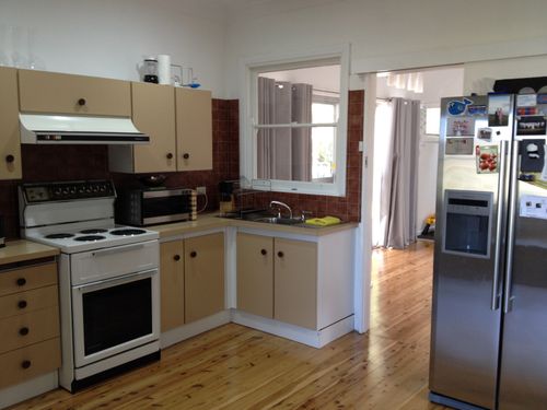
Here is what we were presented with, when we purchased the house about 18 months ago.. The fridge is to the right of the photo, but its separated from the main part of the kitchen by a doorway, and the small pantry is to the left of the photo. It too, is separated from the main part of the kitchen..
As you can see, it is extremely small, and actually has no preparation space, except for the small surface to the left of the oven, so the coffee machine has to be put away after every use, so that we've got some spare bench space.
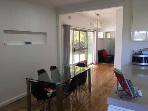
For perspective, here is a couple of other photos of the room, which show the dining table in relation to the kitchen.. The wall/window/doorway behind the sink is marked for demolition, as i'd like to remove this 'barrier', which separates the living areas at the back of the house..
This being the case, as the removal of this wall was an opportunity to open up the back of the house, the most sensible location for the new kitchen was not in the existing space, but flipped to the opposite side of the room (ie: switch the kitchen and dining rooms)..
Fast forward - I've now had the carcass of the new kitchen installed in the new location, and existing kitchen is demolished, (which exposed some asbestos sheeting and was appropriately removed)... Here are some progress photos from that stage..
Following on from that, we now currently have the stone benchtop installed, and ready for the next phase of work.. Its been like this for a few weeks now, because the new kitchen is functional, so I suppose i can take my time from this point..
I went for a 80mm casesarstone benchtop in "Clamshell" colour, as I was hoping it looked like a polished concrete benchtop.. Of course, you can tell its not polished concrete, but i'm pretty pleased with the result..
Next steps, in my next update will hopefully be -
a) removal of old kitchen window/wall, and make-good existing kitchen walls
b) installation of hardwood exposed shelves in corner (in the gap to the right of overhead cupboards -see last photo)
c) tiled splashback
Hopefully my first post has been appropriate for the website.. Looking forward to some feedback and/or suggestions...
Cheers,
Jamie
- Mark as New
- Bookmark
- Subscribe
- Mute
- Subscribe to RSS Feed
- Highlight
- Report Inappropriate Content
Re: First post - first renovation (kitchen)
Well done @jaga.
What kind of tiles and pattern are you going to go with for the splashback?
I don't ever like removing windows. Are you sure you are still going to have sufficient light? A skylight could be an alternative...
- Mark as New
- Bookmark
- Subscribe
- Mute
- Subscribe to RSS Feed
- Highlight
- Report Inappropriate Content
Re: First post - first renovation (kitchen)
Hi @RenoQueen
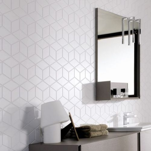
I like this type of pattern.. for the splashback.. This images is from a local tile supplier - Earp Bros.. Obviously we wouldn't be laying it to the full height like this image, just to the underside of the overhead cupboards..
The window i'm talking about removing is actually an internal window (see above existing sink).. We believe this to be the original external wall of the house, which became an internal wall during extensions by the previous owner (sometime in the 80's).. For this reason, i believe it may be a load-bearing wall, meaning some additional structural work may be required..
By removing the wall which contains this window, we're hoping to greatly increase the amount of light coming from the back sliding doors.. See sliding door with grey curtains, from the photo below...
I'd love to put a large skylight in the ceiling of the new kitchen, as you suggest, but there is an existing ceiling fan smack-bang in the middle of the room.. Of course, we could offset the skylight next to the fan, but do you happen to know whether we are likely to get like a 'flickering / strobe' effect when the fan is turned on?
Jamie
- Mark as New
- Bookmark
- Subscribe
- Mute
- Subscribe to RSS Feed
- Highlight
- Report Inappropriate Content
Re: First post - first renovation (kitchen)
Thanks for the photo of the internal window @jaga, that helps to visualise the space. I think you are spot on - it does need to be removed. @BIM_Engineer might give you some thoughts about the challenges of dealing with load-bearing walls.
Love the tiles, they look great. One consideration though - using a small tile for a kitchen splashback obviously means lots of grout which means lots of cleaning. I prefer glass splashbacks for ease of cleaning.
- Mark as New
- Bookmark
- Subscribe
- Mute
- Subscribe to RSS Feed
- Highlight
- Report Inappropriate Content
Re: First post - first renovation (kitchen)
Hi Jamie
Welcome to the forum and thanks for the post
@RenoQueen I am happy to put up generic details & engineering
@jaga if you require specific items please include more information,dimensions and photos ie external roof line, internal ceiling space,etc. That way I can also provide specific data relevant to your requirements/project, while the additional Info & Photos helps others hth
- Mark as New
- Bookmark
- Subscribe
- Mute
- Subscribe to RSS Feed
- Highlight
- Report Inappropriate Content
Re: First post - first renovation (kitchen)
Looking good so far. All I will say is don't skimp on the powerpoints. As a sparky I hear this all the time and it is far easier (and cheaper) to get these installed before the tiles are laid.
Cheers'n'beers
Daryl
- Mark as New
- Bookmark
- Subscribe
- Mute
- Subscribe to RSS Feed
- Highlight
- Report Inappropriate Content
Re: First post - first renovation (kitchen)
Great advice from @darylhewston. You can never have too many power points!
Daryl, have you installed anything like this pop-up powerpoint? It looks like a good option for those with limited space.
- Mark as New
- Bookmark
- Subscribe
- Mute
- Subscribe to RSS Feed
- Highlight
- Report Inappropriate Content
Re: First post - first renovation (kitchen)
@RenoQueen
This pop-up power point is exactly what we installed.. You can see the small round lid in the corner of the benchtop in one of my photos above... It cost about $350, and has two standard outlets, and two USB outlets.. Easy to install, as the pop-up unit comes with a standard power cable and plugs into a GPO, which we located behind the bank of drawers.. Key thing to note however, is that the carcass needed to be an extra 100mm deep, to allow space behind the drawers for the pop-up to retract.. This was good, because i wanted an extra deep bench space anyway (700mm)
Can't comment on the usability of the retractable outlet though, as the GPO circuit wont be connected until the splashback is completed.
In addition, we have another three double-GPO's in the corners of the kitchen.. Hopefully this will be enough..!
- Mark as New
- Bookmark
- Subscribe
- Mute
- Subscribe to RSS Feed
- Highlight
- Report Inappropriate Content
Re: First post - first renovation (kitchen)
G'day all,
I did actually think about putting in a couple of these when we did up our kitchen, but when I saw a sample at the wholesalers, I thought that just maybe "stuff" would be caught within so just went with standard powerpoints on the ends of the island.
And at the time we were on a very tight budget so I couldn't really justify spending that type of money. Maybe in the future. Still a very good idea.
Cheers'n'beers
Daryl
- Mark as New
- Bookmark
- Subscribe
- Mute
- Subscribe to RSS Feed
- Highlight
- Report Inappropriate Content
Re: First post - first renovation (kitchen)
Hi Everyone,
For those who are interested, here is an update on the kitchen project.. I've also started another project in the last week and will post separately..
I have now opened up the dividing wall (which contained a window) to create an open-plan dining room/breezeway towards the back of the house.. From the previous photos, you can see that this was the existing location of the kitchen, and also the existing 'external wall' of the house (prior to 1980's extensions by previous owner
There was some concern that this was a load-bearing wall, however my chippy found that the trusses were in fact running parralel with this wall, and there was no roof member bearing on this wall whatsover.. Still, to ensure integrity of the wall overall, we installed a new lintel, bearing on the existing stud wall, and boxed around the lintel to form a plasterboard bulkhead. (@BIM_Engineer, @RenoQueen)
The opening is now sheeted, set, sanded and the white colour you can see is an undercoat only.. Also, owing to the existing asbestos on the walls, I re-sheeted the whole area, which gave way to an opportunity to install a new rebate/shelf in the plasterboard wall.. (my wife has already put some candles in it..!!)
I'll properly paint the whole dining/kitchen room once the kitchen is totally finished.
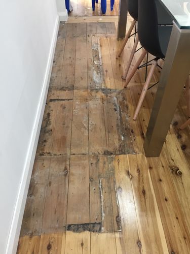
This has left me with a small problem of the timber floor, specifically, that it is not sanded/polished beneath the footprint of the existing kitchen. I don't really want to have to sand/polish the entire floor, as this will cost A LOT..! Has anyone had any experience in patching/sanding a small section, specifically blending-in with the surrounding finish? See image below.
Jamie.
Why join the Bunnings Workshop community?
Workshop is a friendly place to learn, get ideas and find inspiration for your home improvement projects
We would love to help with your project.
Join the Bunnings Workshop community today to ask questions and get advice.


