The Bunnings Workshop community can help with your home improvement projects.
- Bunnings Workshop
- >
- Discussion
- >
- Kitchen
- >
- Re: Kitchen update - visualisation not m...
How to visualise a kitchen update
- Subscribe to RSS Feed
- Mark Topic as New
- Mark Topic as Read
- Float this Topic for Current User
- Bookmark
- Subscribe
- Mute
- Printer Friendly Page
- Mark as New
- Bookmark
- Subscribe
- Mute
- Subscribe to RSS Feed
- Highlight
- Report Inappropriate Content
How to visualise a kitchen update
For my kitchen update, I have made some choices on materials and colours but I am visually challenged I think! I am finding it hard to imagine it in my head:
- Bottom cupboards (Mocha latte) will stay
- Range hood will stay
- Vistelle backsplash over both benches in the L shape (Salt) - no more tiles!
- Benchtop all the way around - Think benchtop solid 38mm (Meringue) - I would prefer the 20mm thick so if you think one of the same range would look ok I would love to see it as well as the 38mm
- Kaboodle (Vanilla essence in gloss) top cupboards from rangehood around the corner to the window - old microwave cupboard will go
- Still deciding on whether I have knobs or no handles on the top cupboards
Looking forward to hearing your thoughts! Looking for a modern update and more storage.. I have an all white walk in pantry to the right of the microwave and another pantry like cupboard in the Mocha colour behind where was standing to take the photos.
the micr


cheers
Erin
- Mark as New
- Bookmark
- Subscribe
- Mute
- Subscribe to RSS Feed
- Highlight
- Report Inappropriate Content
Re: Kitchen update - visualisation not my strong suit
Welcome to the Workshop community @erinpolly. Many thanks for your questions, I'd be happy to kick-off the discussion.
Congratulations on embarking on your kitchen update as I'm sure it is an exciting time for you.
If you would like to have a look at some of your chosen finishes there is a fantastic 3D kitchen planner to visualise how your kitchen might look. You might also be interested in seeing what the @MakeItYours team achieved on a reasonably small budget renovating a kitchen and dining room of a small house.
Some other step-by-step D.I.Y. articles which you might find helpful are how to redesign and update a kitchen, simple kitchen makeover and how to put new handles on kitchen cabinets.
Let me mention @redracer01 to see if they might like to contribute some ideas for your kitchen.
We look forward to following along with you project and I trust our community members will have some great ideas.
Mitchell
- Mark as New
- Bookmark
- Subscribe
- Mute
- Subscribe to RSS Feed
- Highlight
- Report Inappropriate Content
Re: Kitchen update - visualisation not my strong suit
Hello Erin,
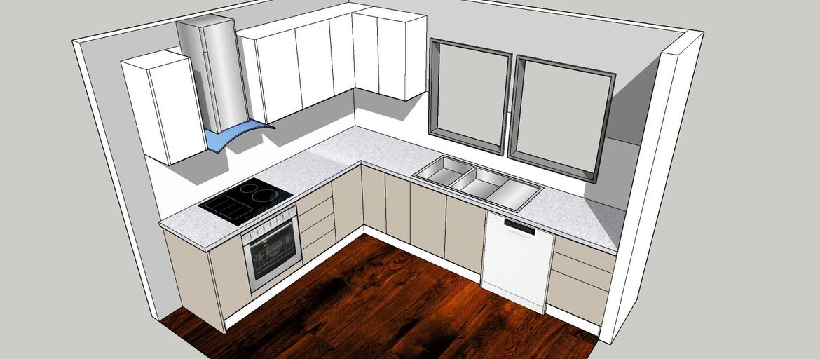
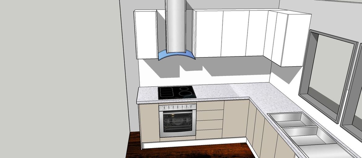
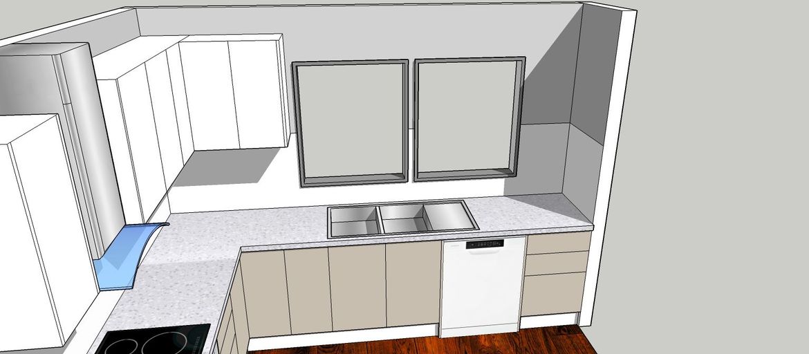
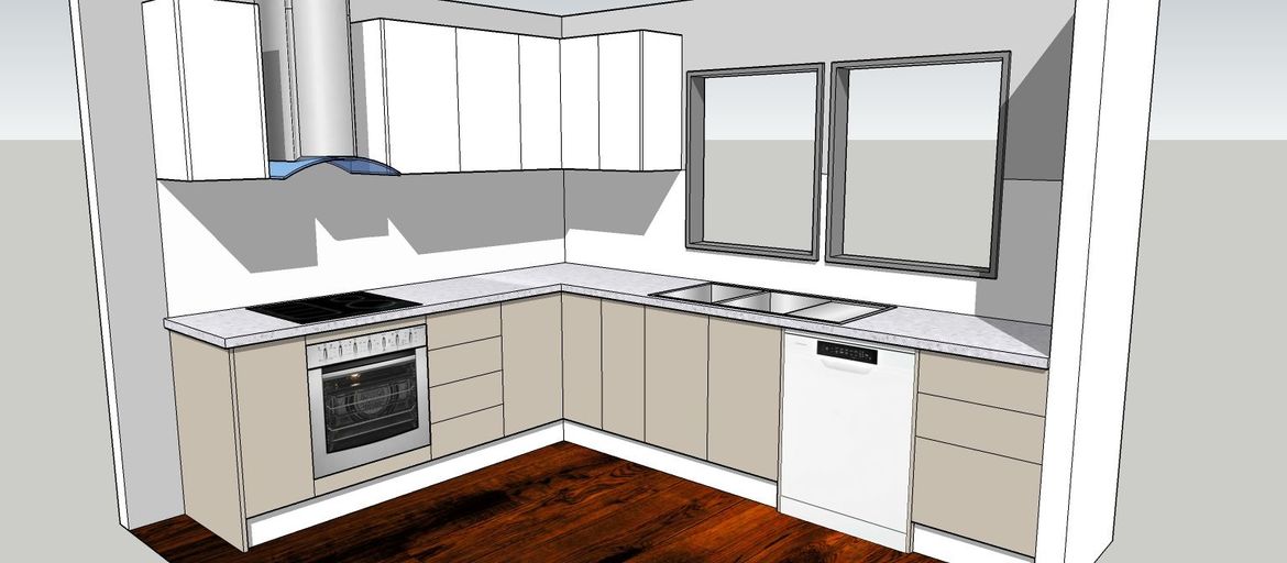
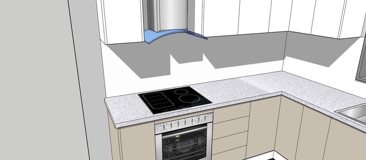
As requested here is the visualization you were requesting for!
- I continued the cabinets in mocha latte to match your cook top side.
- To balance the look of your kitchen, I suggest your rangehood to be lowered so that is in line with the bottom part of your new wall cabinets. This is still allowed as you have an electric cook top and the required distance is 600mm from your cook top to the bottom of your range hood. Please check with your local council for rules and regulations in your area.
- I've colored your wall a light gray to create contrast for your new splash back ( salt ) in the Vistelle range
- I've drawn the top at 38mm this gives it more of a solid feel and is in keeping with the look of your current kitchen.
- Vanilla essence is a light color and is difficult to replicate on the computer screen so I've placed the color as close as possible.
- Handles are at your discretion, why not bring one of each home and test it on your current doors and see which one you like?
I hope you enjoy the drawings and that it gives you inspiration to explore the possibilities. If you have any more questions drop us a note here on workshop.
Cheers,
Red
I am a Bunnings team member. Any opinions or recommendations shared here are my own and do not necessarily represent those of Bunnings. Visit the Bunnings website for assistance from the customer service team.
- Mark as New
- Bookmark
- Subscribe
- Mute
- Subscribe to RSS Feed
- Highlight
- Report Inappropriate Content
Re: Kitchen update - visualisation not my strong suit
Thank you for these pics! It has certainly helped with visualising the updates. I think I might need to rethink the benchtop colour back to a less busy option ie white with a small sparkle. I'm not sure that the stone like options come in the colour I'm thinking. Do any of the thermos benchtops come in a high gloss to look more stone like? I am also thinking I should change the upper cupboards to finish at the wall with the window rather than go around the corner. I am worried they will dominate the space as I don't have the open style kitchen with an island where the upper cupboards tend to look good. I'm also a bit concerned about the two tone cupboards so might look to replace the bottom cupboard doors to match? I am definitely out of my comfort zone on this - cant imagine what I would be like with a full house reno! Great point about the handles!
- Mark as New
- Bookmark
- Subscribe
- Mute
- Subscribe to RSS Feed
- Highlight
- Report Inappropriate Content
Re: Kitchen update - visualisation not my strong suit
Hi @erinpolly.
I'd be happy to assist with your questions about gloss benchtops and their availability. I apologise though as I am not familiar with "thermos" benchtops, is that the brand? If you can give me details of the specific benchtop and finish I can contact the manufacturer to find out the answer.
Mitchell
- Mark as New
- Bookmark
- Subscribe
- Mute
- Subscribe to RSS Feed
- Highlight
- Report Inappropriate Content
Re: Kitchen update - visualisation not my strong suit
Hi @erinpolly ,
Your kitchen reno is going to look amazing. I would keep the darker colour for the bottom cupboards. It provides a great contrast and visual interest to have the colour contrast between the top and bottom cupboards.
if you’re concerned about the top cupboards overwhelming the space, you could keep them across the one wall. On the window wall, you could put some open shelves on each side of the windows to balance the look. That would give you some extra storage while not closing in the space.
I agree, a lighter benchtop would look better, with sparkles or even a pale grey vein marbling through it.
Regarding the rangehood, it looks much better and will be more effective being down lower. Keep in mind those corners in relation to eyes and heads bumping, when deciding on final placement.
Good luck with it all, it’s going to look awsome.
Cheers, Sandie
- Mark as New
- Bookmark
- Subscribe
- Mute
- Subscribe to RSS Feed
- Highlight
- Report Inappropriate Content
Re: Kitchen update - visualisation not my strong suit
Hi redracer01
May I ask what program you use for these drawings? I have a weird fascination with floor plans and designs, love to 'play' with different ideas...
Cheers
Jill
- Mark as New
- Bookmark
- Subscribe
- Mute
- Subscribe to RSS Feed
- Highlight
- Report Inappropriate Content
Re: Kitchen update - visualisation not my strong suit
Hi @JillofallTrades,
Let me mention @redracer01 so they are alerted to your question. I managed to locate where they have previously said: "I use free software called Sketchup". A similar 3D kitchen planner is also available on the Kaboodle site.
Mitchell
- Mark as New
- Bookmark
- Subscribe
- Mute
- Subscribe to RSS Feed
- Highlight
- Report Inappropriate Content
Re: Kitchen update - visualisation not my strong suit
Hello @JillofallTrades
As mentioned by @MitchellMc Sketchup 2017 ( the free version ) Check google you'll be spoiled for choice on free 3d software.
Cheers,
Red
I am a Bunnings team member. Any opinions or recommendations shared here are my own and do not necessarily represent those of Bunnings. Visit the Bunnings website for assistance from the customer service team.
Why join the Bunnings Workshop community?
Workshop is a friendly place to learn, get ideas and find inspiration for your home improvement projects
We would love to help with your project.
Join the Bunnings Workshop community today to ask questions and get advice.
